How many apps do you have on your smartphone? Now, how many of them do you use on a regular basis? Daily? Once a month? Once in a blue moon? And how many have you downloaded and later deleted? Thought so. Retention is a real issue for all kinds of app developers and owners.
We’ve talked before about using push notifications to keep app users engaged. However, strong user communications can’t solve all your problems. A solid app retention strategy also requires smart design and ongoing content development. That’s what we’re going to talk about today—how to build in stickiness at the design and content level.
First: Ask yourself what you’re really trying to do.
Ultimately, building an app means creating an experience to surround what you want people to do or buy, and also creating engagement or utility that leads to that action.
The experience you build may be primarily geared for content consumption (news, entertainment), utility (weather, wayfinding), commerce (hotel, retail), or gaming. It may be a hybrid of those things. But keep in mind that brands often go wrong by trying to be everything to everybody. Your audience may just want to shop. Or they might just need wayfinding. From the outset, know what you’re trying to do, for whom, and why.
5 starter tips for built-in stickiness
1. Good apps are good guides.
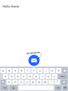
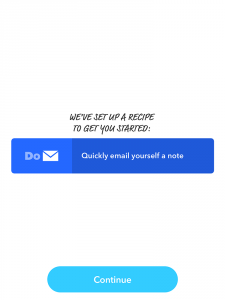
As you go along, a good app shows you new things, gives you smart advice, offers unique benefits because of who you are or your level of activity, and makes everything easy. ITTT’s Do app is a great example of using explicit and implicit instructions to help users familiarize themselves with the interface and start using the app right away.
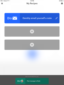
Do’s explicit instructions (“Quickly email yourself a note”) and implicit instructions (gray boxes suggest new items and actions).
2. Above all, be useful.
Apple’s App Store will reject purely marketing-based submissions—your app must provide some kind of value. We recommend reviewing the App Store review guidelines, but here are a couple of examples from those guidelines:
- “Apps that are not very useful, unique, are simply web sites bundled as Apps, or do not provide any lasting entertainment value may be rejected.”
- “Apps that are primarily marketing materials or advertisements will be rejected.”
Apple is definitely not kidding around here. So what sort of value are we talking about? It might be:
- Discovery — ex: showcasing cool products so I don’t have to look for them
- Promotional — ex: offering coupons and special deals
- Entertainment — ex: live-streaming video from a sporting or media event
- Utility — make it easy to pay, show me how much money I’m saving
Of course, it’s also important to make sure that the value you are offering is actually relevant to your audience. If your prospective users are primarily seniors, for example, in-app payments might be completely outside their comfort zone and therefore pretty useless..
(NOTE: The Google Play store for Android-based apps has less stringent requirements, but it’s still a good idea to review them.)
3. Tell people where to look and what to do.
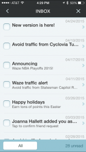
People generally don’t like to dig very deep into apps, so it makes sense to incorporate a social media-style feed to surface content from different areas of the app and move it forward.
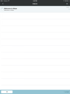
Tell people what to do. When you’re trying to capitalize on your users’ limited time and attention, push forward the actions you want them to take next. Many apps have adopted notification centers for this purpose. Here’s an example from Waze:
4. Keep it fresh.
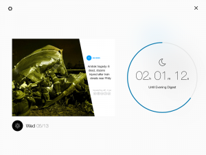
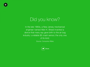
It’s a good idea to update your content at least once a day. Bear in mind, these content updates don’t have to be huge forklifts of information. Think like Facebook or Twitter—add snackable bits of news or timely reminders to your feed. Most platforms make it easy for marketers and other stakeholders to keep things fresh. Yahoo News Digest provides regular updates and has built-in design features that let you know how long it will be until the next update, and it gives you an interesting (and socially-sharable) quote when you consume all of the content in your digest.
5. Give them the VIP treatment.
People who download your app are often your most interested and loyal customers. They’re showing a certain level of commitment, so reward them with the VIP treatment through personalization.
Here are some examples:
- Tailor the newsfeed to her interests and in-app behavior—surface things she wants to see.
- Personalize the greeting and images to her location and the time of year.
- Change the app behavior based on her location. When she walks into your store, for example, the app could present her shopping list with a map leading directly to items on the list, and links to those products on the website.
- Use rewards to keep users coming back—this can be anything from special discounts or loyalty program points to simply showing a fun animation during the greeting.
The truth is, a solid app retention strategy is an ongoing, multifaceted process that starts with initial design and never really ends. You can no longer put up a website and just leave it there, unchanged, for the next five years. The same is true for apps—users must be nurtured (they’re worth it) and your content and features must be continually refreshed (also worth it). Check out our eBook for sticky notes about how you can re-engage your app users like a boss.
Want to sit around and nerd out on app retention strategies? Give us a call. We love this stuff.


